Friday, 27 August 2010

Steve Lovett

Blog Question: How has Steve Lovett's practice evolved over the period of his professional career, ie. from political, social/historical concerns to issues of colour and form.

I have been expecting Steve's lecture in since I saw the lecture list. Because I like Steve's class very much. To myself, I'm very keen on making 2D work instead of 3D. And Steve is the very accomplished artist who like making 2D print works. Fortunately, my first 4week studio class is with Steve. So, by having his class help me have a better understanding about the content of Steve's lecture.

Basically, most of Steve's earlier projects are interactive works, which he worked with friends and other fellows, and the things behind the collaborative works are people's personal history and story. Steve's idea is like to identity the relationship between the objects he printed and the personal story behind the objects.

In the beginning of the lecture, Steve introduced us what is his work exactly talk about. He told us his work are concern with historical narrative and story telling which are quite personal and private. And this idea makes Steve's work very individual and creative.Obviously, in some of Steve's work, I saw lot's of portraits prints. Like the "Bamb\Darren", "Speaking Parts". And the stories behind the portrait prints can usually reflect some social issues or flexible notions of community.
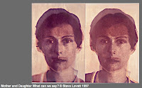
I select one work from Steve's portrait prints called "Mother and Daughter What can we say?" which I consider can relate to some social issues. I like the idea of how this work speaks about notions of community and attachment. As we can clearly see that Steve uses different layers with different colours to print the female portrait. It looks like the portrait is separated from one to two. This work can make us think of how can we know ourselves through our interaction and conversation with the people around us everyday. And how can interaction and dialogues identity ourselves from other person.

Steve's work generally changed after 2000. His works are more relate to using space to present ideas. Political and historical are still the main orientation of his work. During this period, I found most of his work are more about film sequence.


For example, the "Intersection" 2007, Steve explained that "Each of the works in this show featured observation of a single location at different times of the week, looking a different usage of a single site." It is talk about the connection between time and space. At different time, the things happened in same space will be different. It is like some people individually participate in a public space, and their personal discourse then become part of the public narrative in the space.


I'm deeply inspired by Steve's lecture and his class. He taught me how to come up with a good idea and how can I push my original idea to something new. I like the way how Steve expresses his ideas in a visual form. Most of his works are in print form. And I like print because I think print work have a nobility and a humanity about them, something you can not achieve solely by computer or electronic printer. I like to see something with hand-made feeling.

Friday, 20 August 2010

Frances Hansen's Lecture Respond

Frances Hansen briefly taught us life drawing in last semester, from her classes(although I didn't know Frances Hansen's work before) I thought her artwork should be something like representing the beauty of human body or physical beauty. However, finally I found her art style is expressing life objects she collected in her everyday life and making unattractive things attractive. And by looking at her art painting, I realised this sort of art is very unfamiliar to me and I never touched materials art making before. So, Frances Hansen's art paintings widen and broaden my mind of how I thought about art.
I'm really interested in Hansen's art making process. It's including collecting, constructing, thinking and changing. Hansen showed us various objects she collected previously and told us the process of how she reworked with her collections. Put aside the art style for a moment, the first thing I was focus on are the things she painted. For instance like packaging materials, cleaning bottles, glasses and even some paintings made by her children. Secondly, there are some design elements I find from the way of how Hansen constructing those objects: The negatives/positives shapes always appear in her work which are obvious, and she also using different colours divide up the whole painting and using light colors draw objects on the background. So, viewers can feel the strong sense of decorative design.
I think this is very close to the class I had with Steve Lovett at last semester-material drawing. At that time, I did a lot of material collections, find out what materials are useful for my drawing and investigate how could those second hand objects be changed and developed. And what Frances Hansen doing is just changing her life objects and doing something surprising with them. The most important thing we should learn is not the working process, the key is how we think about our life and how we respond to our life.
There are some materials drawing artists' works that are also very similar to Hansen's work. For example, ED Ruscha, a famous American whose mode of creation is using text as objects in his paintings.
"In some works, phrases float across sunsets or pretty blue skies; in others they’re barely visible and painted on stained canvases with egg yolk. In many ways he uses words as if they were objects and even in his eerie silhouette paintings they make their presence felt."http://www.elleuk.com/culture/art
Others like Hany Armanious who like to use sculptural form to represent everyday objects. I really like the Porcelain Palace because it is a very typical life object drawing.


PORCELAIN PALACE2008Cast polyurethane on plywood8 x 16 x 2 in. (20.3 x 40.6 x 5.1 cm.)


"HANY ARMANIOUS produces installations and sculptural forms, as well as paintings and drawings that engagingly expand upon the role of the artist and the form of the artwork. He consistently surprises with his deft working and reworking of objects, materials, and references, remodeling the everyday in oddly lyrical ways." http://www.foxyproduction.com/artist/view/639
In short, Hansen's works are about developing and changing her life objects in a special way. A way that can change a normal thing to an artwork or something that could pay more people's attention. There are so many life objects that can hardly let people to notice. In fact, usually, the extraordinary thing is just come from some ordinary things. Artists' job is to discover unusual things from normal life. Anyway, Hansen's works inspire me a lot, show me how could I think up a good idea if I'm going to do a project and tell me art is come from life.

Friday, 13 August 2010

Semester2---Moving Image respond

Moving image is a kind of new art form when compared with some traditional graphic art forms. I am really interested in moving image art cause I like watching movie. No matter contemporary movies produced by Hollywood or some black and white movies produced in early time, all sort of movies attract me very much. Through listening Eidon Booth's lecture about moving image, I understood more facts about moving image making and how it made. Some terms that mentioned by Eidon Booth are very important in making moving image like montage, panning, split screen, editing and so on.
Another issue mentioned in Edion Booth's lecture is about what moving image represent. Some people might say reality, because things like TV program, movie are all acted and played by real person and events happened in movies are commonly happened in real world as well. Others would say illusion, because some of the programs are edited from fiction or some airy play. In my opinion, Moving image is talk about reality, but the reality has been edited and designed, so I think the relationship between reality and illusion is blurred. I would like to use some of the film terms to discuss Edion Booth's exploration of reality and illusion.
Split screen
One of the videos Edion showed us is a movie that divided in two frames, so viewers can watch two different screen which are talk about different things at the same time. Interestingly, this two frames actually have a connection. By this method, viewers can watch and think about the connection between the two frames. There are lots of television works using this method to represent some social reality. Once I saw a TV program, the screen is divided into three frames. first one is a man illicit intercourse with a beautiful girl on the bed. Second one is the man's wife is doing housework for her husband. The third is the girl's boyfriend is buying red roses for her. The three events are happen at the same time, viewers can watch them and think about more social problems.
Panning
I think panning is a movie style which is more close to our live. Panning is not always happened in old movie. Panning is just like holding a camera we brought and taking video for our friends or record our daily life. And when we project the video we made through camera, we will find the screen is keep shaking. However, this kind of method had been used in Hollywood's film making.Cloverfield, a 2008 American monster movie directed by Matt Reeves. The whole movie just like a video recorded by a war journalist. It's like a person who recorded the whole real disaster happened in New York. It seems like panning is a sort of visual impact that can make people feel something more real.
Montage
I still remember Edion once said we create a reality in the screen and the reality we create can help people understand the reality in the real world. To make this thing happen, montage is a great skill to use.
" Montage is a technique in film editing in which a series of short shots are edited into a sequence to condense space, time, and information. It is usually used to suggest the passage of time, rather than to create symbolic meaning as it does in Soviet montage theory."http://en.wikipedia.org/wiki/Montage_(filmmaking)
Nowadays, the montage is integrate into most of the big budget film productions. This technology is so common in the contemporary film. Each frame's field of view, angles, length and the combination of the frame and audio have montage element. It is observed that the montage has been used while the film started. In the final analysis, montage is way how director talk about a story to audience. Director just use some of the frames which seems illusional to make a real story with full of appeal.

Friday, 6 August 2010

Dion Hitchens- Interaction and collaboration

In this week, Dion Hitchens made a lecture about his sculpture practice. Through watching lots of his sculpture practice I found the works look quite bizarre and much more different from traditional sculpture. I have never done or participated in making sculpture. And to me, the concept of 3D objection is fuzzy. However, as a green hand in sculpture, what I strongly realized in Dion Hitchens' practice is culture and that is what Dion always mentioned in his lecture. Also, another element in his practice which strongly impressed me and made me understood more about sculpture is site.
First I would like to explore culture relating to Dion's work because I think the element culture is incisively and vividly reflected. By looking at his art work, most of them are built as public art projects. This point make me think how hard to making project for public. Making object for public is not as easy as for private. There are so many issues to consider, like a fund, time slicing, materials, technical support. All these things may narrow a designer's idea. Most importantly, a public art object people making must be accepted by the public of an specific area. Culture refection is a good method for designer to think about cause it can effectively accepted and confirmed by public. So, it's fantastic to see lots of Maori culture elements in Dion's art making.
For example, Matariki Star Waka sculpture, made by Dion Hitchens and Charles Koroneho. It is a Maori culture based work and viewer can see various elements related to Maori culture. The most obvious decorations on the Matariki Star Waka are the constellations which are linked by lines that help define different shapes. And when sky becomes dark, these flashy constellations look magnificent. At the beginning, I'm not very familiar with Maori culture and I don't know what are these constellations symbolizing . So, by searching what is Matariki from the Internet I understand Maori worshiping star image, because Maori think star image decide time, ship's position and the harvest of future years.
“They were transformed into objects of remembrance, marking places of historic or spiritual importance where the community gathered to conduct ceremonies, tell stories and share knowledge,” Charles Koroneho said. “This seemed a very fitting theme for a community building and library named Matariki.”
Obviously, from what Charles Koroneho said, Matariki Star Waka sculpture is something that directly and successfully related to the Maori culture.
Another important element I can strongly feel from Dion's sculpture is the site. It's also a knotty problem to deal with. It's really hard to decide where to put a huge scale sculpture at. For a public artwork, outside of street is just a show room in a gallery. Because a site for a artwork is significant. Just like our tutors' saying" a good display can make your work better and a bad display can kill it." I really like the site of Dion's Kotuku, like two iron birds are flying in the sky. The two iron birds are tied on the upside of that area by several thin gage wires(I guess) looks like a symbol of that place, people can see this sculpture from a long distance. Also, the position of the two birds is interesting to see, both of them goes to a negative direction and this should be a balance for site.